Okay, so, you’ve got a website, awesome! But is it *really* working for you on phones and tablets? Let’s be real, if your site isn’t playing nice with mobile, you’re probably losing out on customers, and nobody wants that!
Why Mobile-Friendly Matters (Like, A Lot)
Think about it: when you’re chilling on the couch, waiting for the bus, or, let’s be honest, even in the bathroom (haha!), what are you doing? Probably scrolling on your phone, right? Your potential customers are doing the same. If they click on your link and your site looks like a jumbled mess, or takes forever to load, they’re gonna bounce faster than you can say “bad user experience”.
Google also seriously cares about mobile-friendliness. They actually factor it into their search rankings. So, a clunky mobile site can hurt your SEO big time.
Is Your Site Up to Snuff? A Quick Checklist
Okay, so how do you know if your website is mobile-friendly *enough*? Here are some things to look out for:
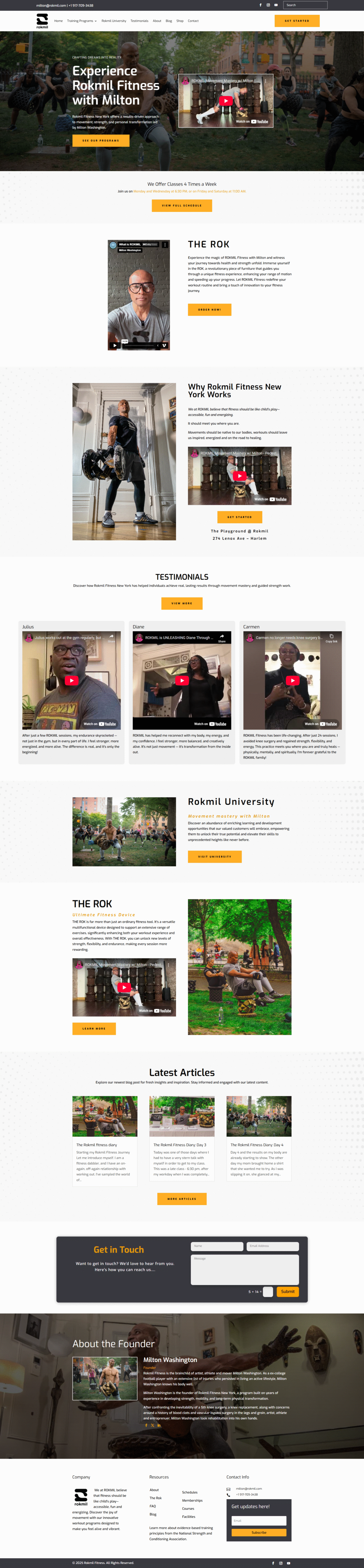
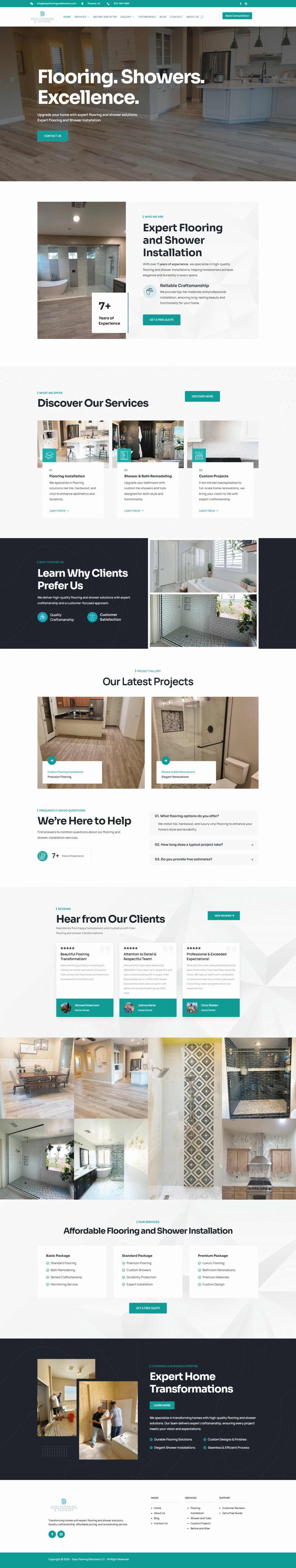
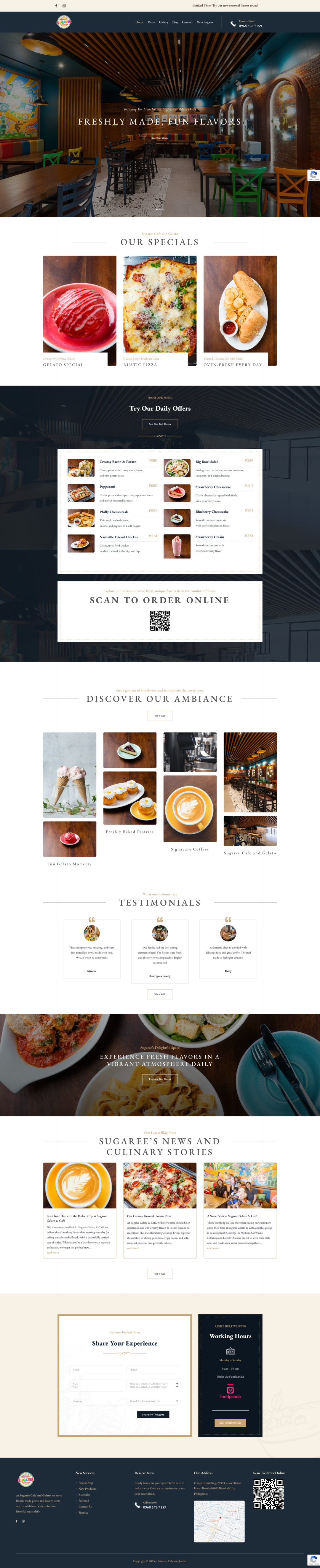
* Responsive Design: This is basically the gold standard. Does your website automatically adjust to fit the screen size of whatever device it’s being viewed on? If you have to zoom in and out just to read anything, that’s a major red flag.
* Fast Loading Times: Nobody wants to wait around for a website to load, especially on mobile. Use tools like Google’s PageSpeed Insights to see how your site stacks up. Images should be optimized, and your code should be clean.
* Easy Navigation: Is your menu easy to use on a small screen? Can people easily find what they’re looking for? A cluttered or confusing menu on mobile can be a huge turn-off.
* Readable Text: The font size should be large enough to read without squinting. Also, make sure there’s enough contrast between the text and the background.
* Touchable Buttons: Buttons and links should be large enough and spaced far enough apart that people can easily tap them with their fingers. Nothing’s more frustrating than trying to click a tiny button and accidentally hitting the wrong thing!
What to Do If Your Site Isn’t Mobile-Friendly Enough
Alright, so you’ve checked your site and realized it needs some work. Don’t panic! Here are a few options:
* Talk to Your Web Designer/Developer: If you have a web designer or developer, they’re probably the best people to help you. Explain what issues you’re seeing and ask them to make the necessary changes.
* Consider a Mobile-Friendly Theme: If you’re using a platform like WordPress, there are tons of mobile-friendly themes available. Switching to a new theme could be a relatively easy way to improve your site’s mobile experience.
* Explore Mobile Website Builders: There are also website builders specifically designed for creating mobile-friendly sites. These can be a good option if you’re starting from scratch or want a simpler solution.
Don’t let a crummy mobile experience push potential customers away. Taking the time to make your website mobile-friendly is an investment that can pay off big time. Plus, your visitors will thank you for making their browsing experience way smoother! Trust me, it’s worth the effort.