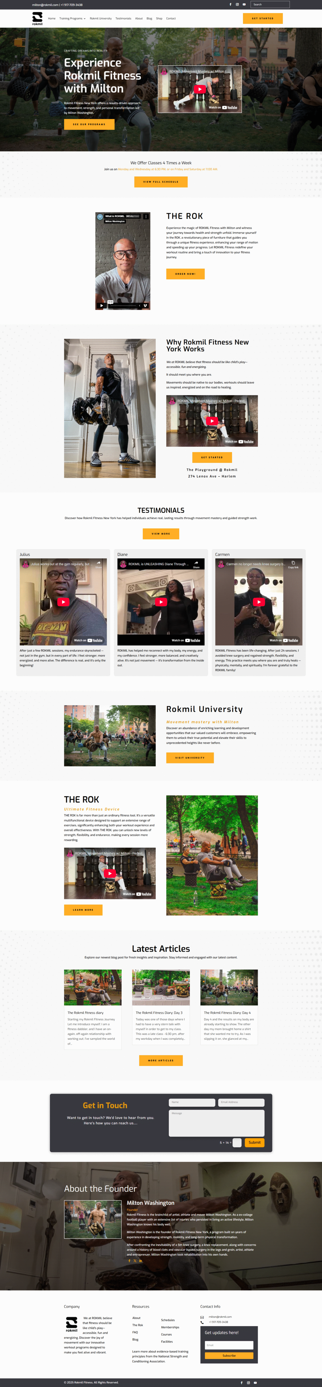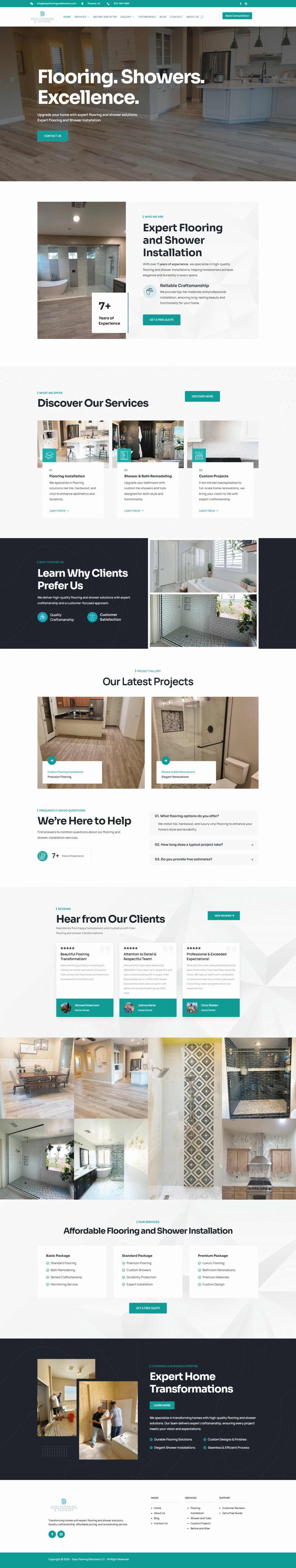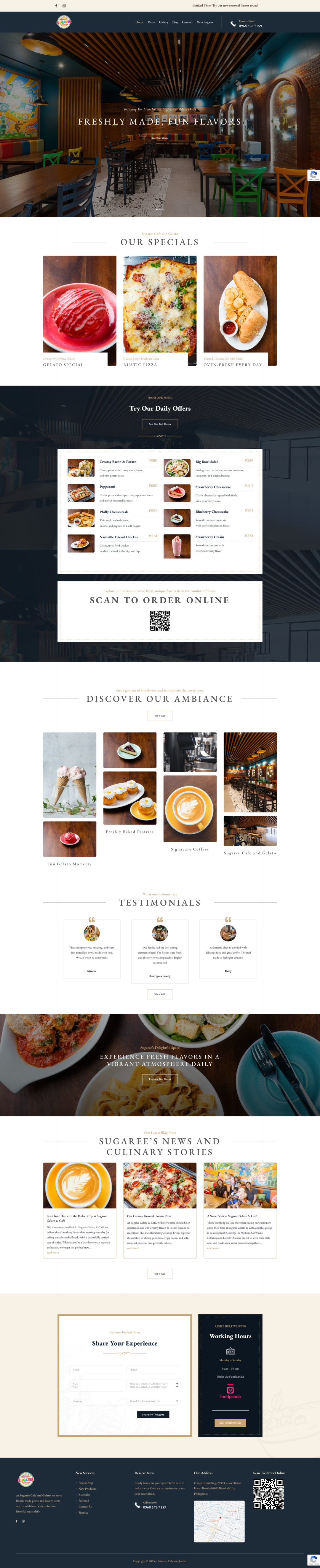
Responsive web design—it’s not just a techy buzzword, it’s actually the secret sauce to making sure your website looks amazing (and works flawlessly) on *any* device. Seriously, from the biggest desktop monitor to the tiniest smartphone screen, responsive design is what makes the magic happen. Let’s dive into why it’s so crucial for anyone with a website.
Reach Everyone, Everywhere
Okay, think about how *you* browse the internet. Are you always glued to your laptop? Probably not. You’re probably scrolling through Instagram on your phone while waiting in line for coffee, or maybe catching up on news on your tablet during your commute. Your website visitors are doing the same thing.
Responsive design makes sure your site adapts to whatever device they’re using. Images resize automatically, text becomes readable, and navigation stays intuitive. It’s all about providing a seamless experience, no matter what.
Boost Your Google Ranking (Hello, SEO!)
Google *loves* responsive websites. Why? Because Google prioritizes user experience, and a site that’s easy to use on mobile devices gets a serious boost in search rankings. Google uses mobile-first indexing, meaning they primarily use the mobile version of your website for ranking and indexing. So, if your site isn’t mobile-friendly, you’re basically telling Google you don’t care about a huge chunk of potential visitors. And nobody wants that.
One Website to Rule Them All (Seriously!)
Before responsive design, you’d often have to create separate websites for desktop and mobile. Talk about a headache! Maintaining two different sites meant double the work, double the cost, and double the potential for errors. Responsive design gets rid of all that fuss. You just have one website that automatically adjusts itself. One set of content, one set of updates, way less stress.
Save Time and Money (Who Doesn’t Want That?)
I hinted at this already, but it’s worth repeating. Because you’re only managing one website, you save a ton of time and money on development, maintenance, and content creation. Updates are easier, fixing bugs is simpler, and you can focus your energy on other important stuff, like creating awesome content or marketing your business.
Better User Experience = Happy Visitors
This is the bottom line, really. When your website is easy to use, people are more likely to stick around, explore your content, and maybe even become customers. A clunky, non-responsive website, on the other hand, will send visitors running for the hills (or, more likely, straight back to Google to find a better option).
Think about it: have you ever struggled to read text on a website because it was too small, or tried to click a tiny button on your phone and accidentally clicked the wrong thing? Super frustrating, right? A good user experience is key to keeping people engaged.
So, there you have it. Responsive web design isn’t just a trend; it’s a fundamental part of having a successful website in today’s mobile-first world. It’s about reaching more people, improving your SEO, saving time and money, and, most importantly, giving your visitors a great experience. If your website isn’t responsive, it’s time to make the switch. Trust me, you (and your visitors) will be glad you did.