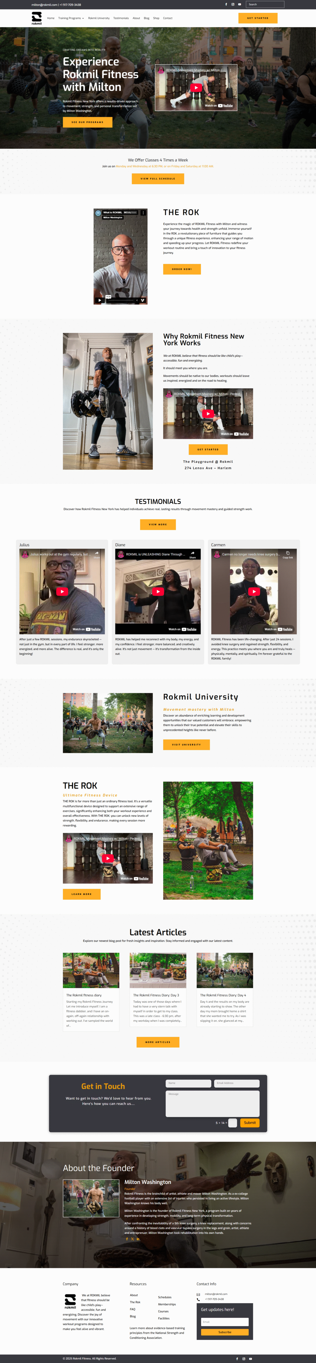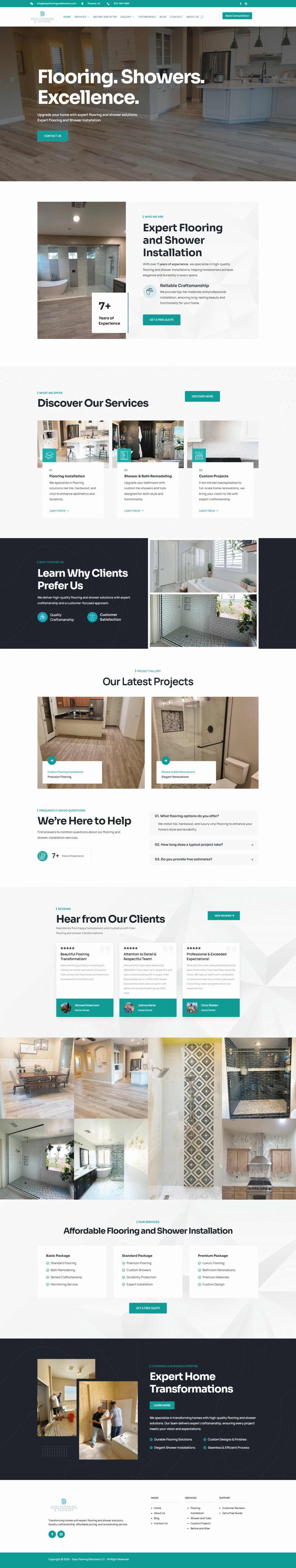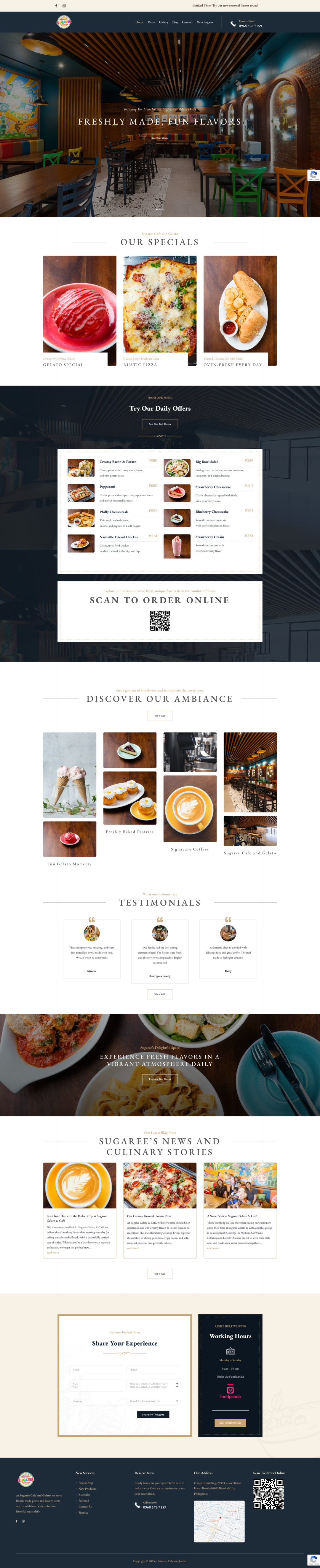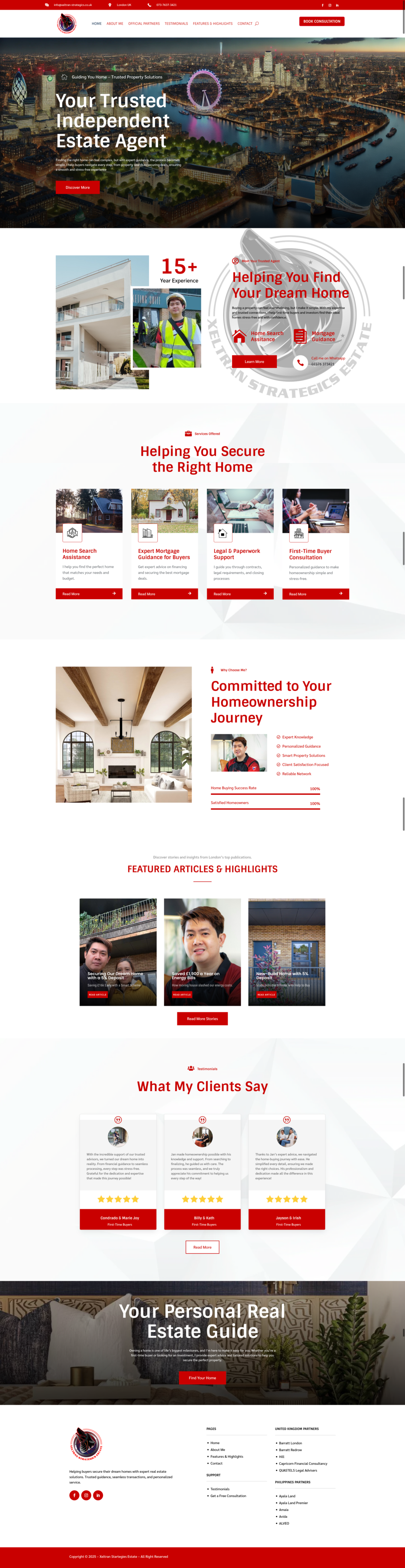
Is Your Website Sending the Right Message?
Alright, let’s get real for a sec. Your website is basically your digital storefront, and just like a brick-and-mortar shop, it’s gotta make a good first impression. But is it *actually* doing that? Is it telling potential customers exactly what you want it to? It’s a question worth asking, because a confused visitor is a lost visitor, and lost visitors don’t convert into paying customers.
So, How Do You Know?
Well, there are a few key things to look at. Think of it like diagnosing a friend who’s feeling a little “off.” You gotta ask the right questions!
Clarity is Queen (or King!)
First things first: is it crystal clear what you *do*? Like, within the first five seconds of landing on your homepage, can someone understand your product or service? If they have to scroll and dig around, you’re already losing them. Use simple language, avoid industry jargon, and make your value proposition obvious.
Imagine someone stumbles upon your site after searching for “organic dog treats.” If your homepage is filled with artsy photos and vague descriptions, they’re bouncing faster than a rubber ball. But if it screams “Healthy, Delicious Dog Treats Made with Organic Ingredients!” BAM! You’ve got their attention.
Are You Talking *To* Your Audience?
This is HUGE. Your website shouldn’t just be a brochure regurgitating facts. It should be a conversation. Use “you” a lot. Address their pain points directly. Show them you understand their needs and that you have the solution.
Think about it: are you writing *at* people, or *with* them? A website that talks *at* you feels impersonal and salesy. One that talks *with* you feels relatable and trustworthy.
Is Your Design Helping or Hurting?
Okay, let’s be honest, nobody wants to hang out on an ugly website. A clunky, outdated design screams “unprofessional” and “out of touch.” Your design should be clean, modern, and easy to navigate. Think about your user experience. Is it easy to find what they’re looking for? Is the checkout process smooth?
And it’s not just about aesthetics. Your design should also *support* your message. Colors, fonts, and imagery all contribute to the overall feeling of your brand. Make sure they’re aligned with the message you’re trying to convey.
Call to Action: Where Do You Want Them to Go?
Every page on your website should have a purpose, and every purpose should lead to a call to action. Do you want them to sign up for your newsletter? Request a demo? Make a purchase? Tell them! Don’t be shy!
Use clear, concise, and compelling calls to action. Instead of a generic “Submit” button, try something like “Get My Free Guide!” or “Start My Free Trial Now!” Make it obvious what they’re getting and why they should click.
Time for a Check-Up!
So, is your website sending the right message? Take a good, hard look at it through the eyes of a potential customer. Ask friends, family, or even strangers for their honest feedback. It might sting a little, but it’s the only way to truly know if your website is working for you or against you. If it’s not quite hitting the mark, don’t be afraid to make some changes! A little tweaking can make a world of difference. Good luck!