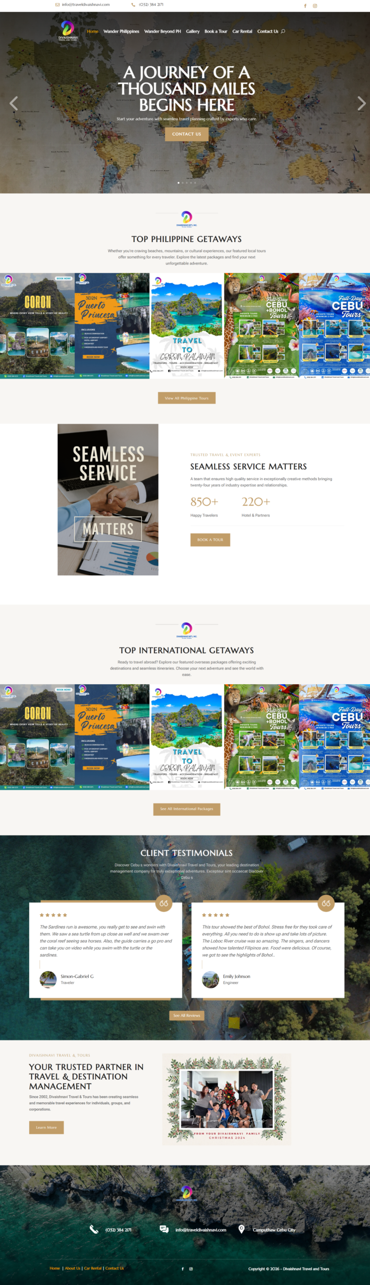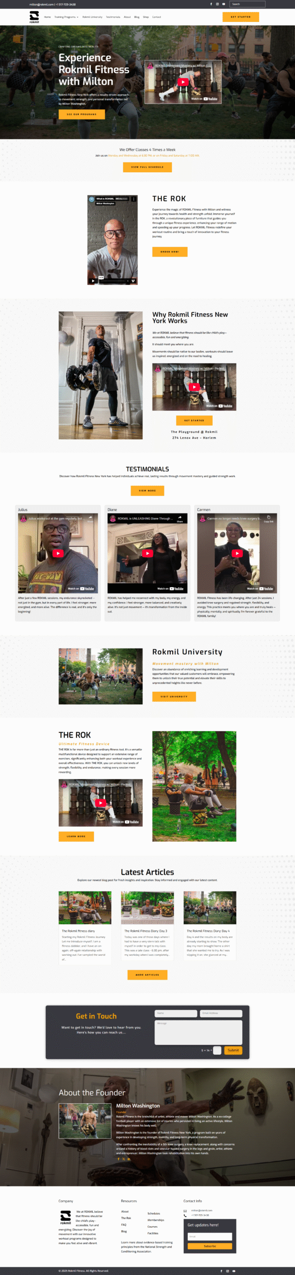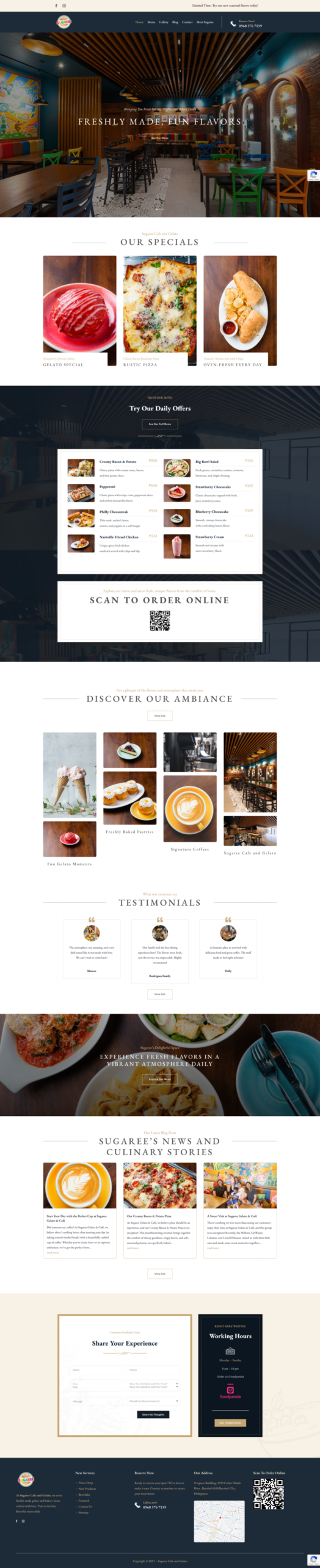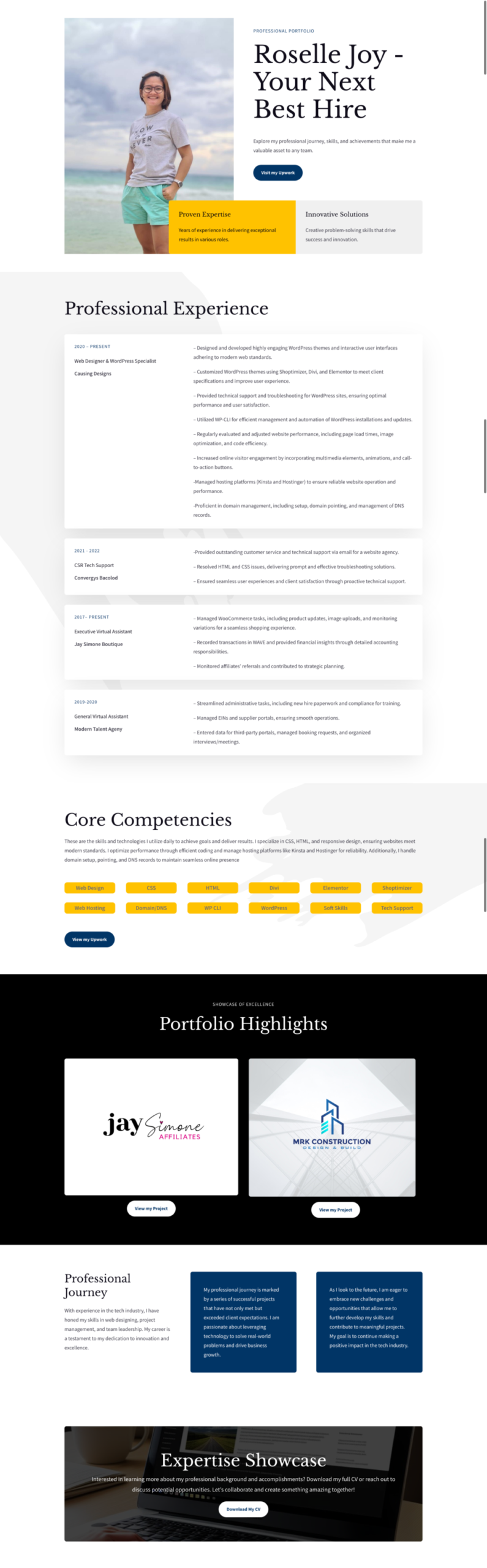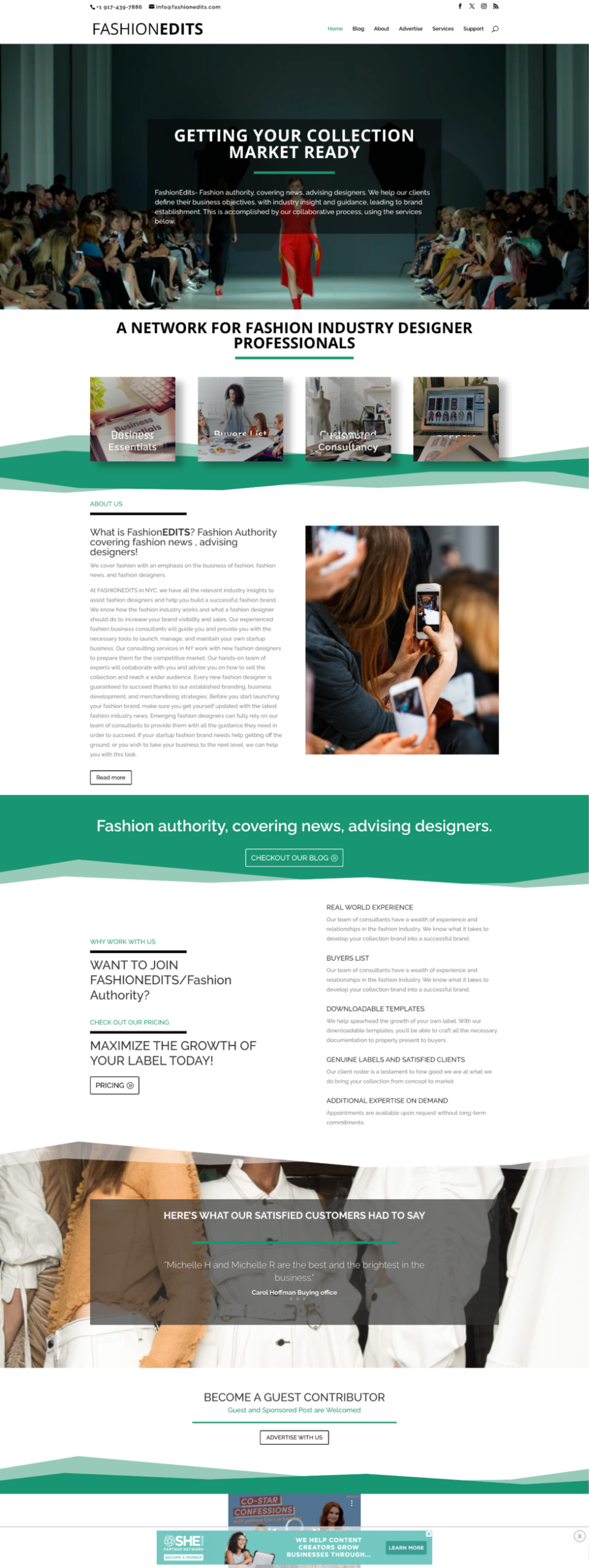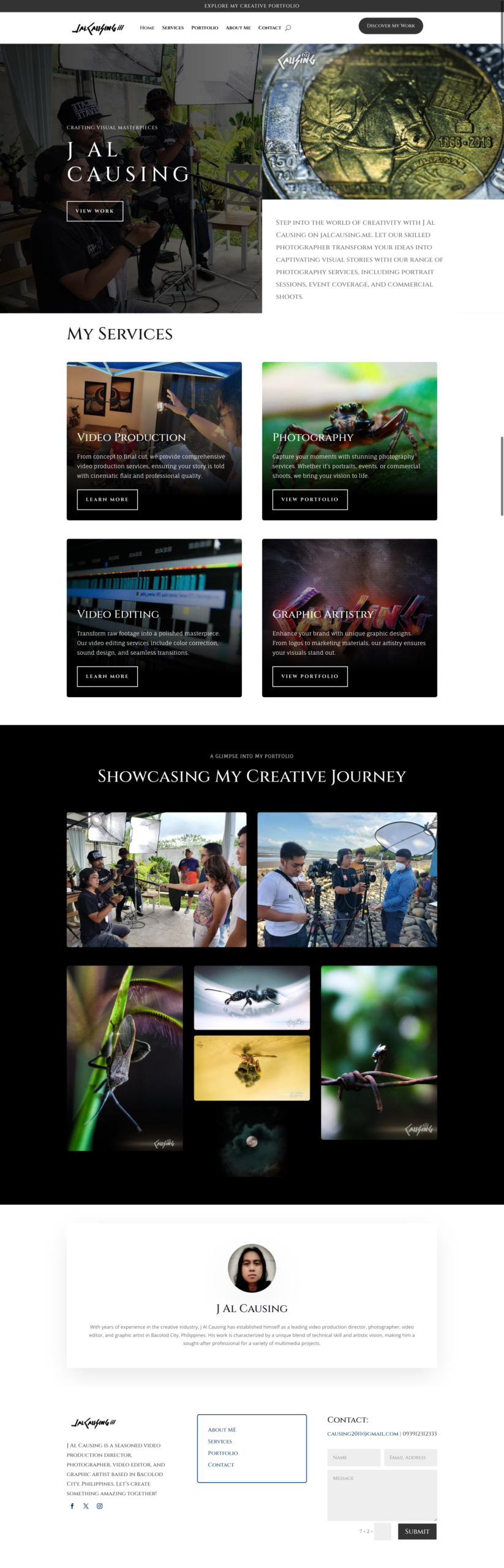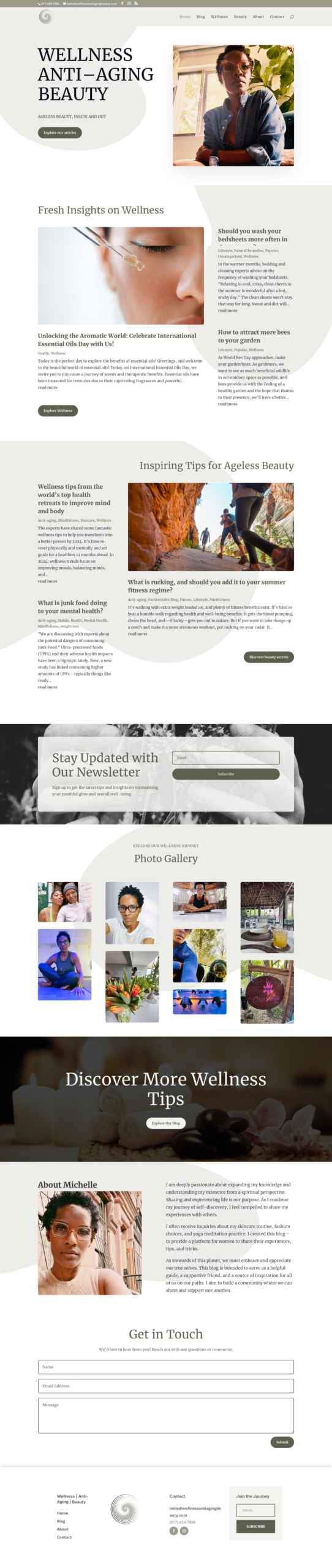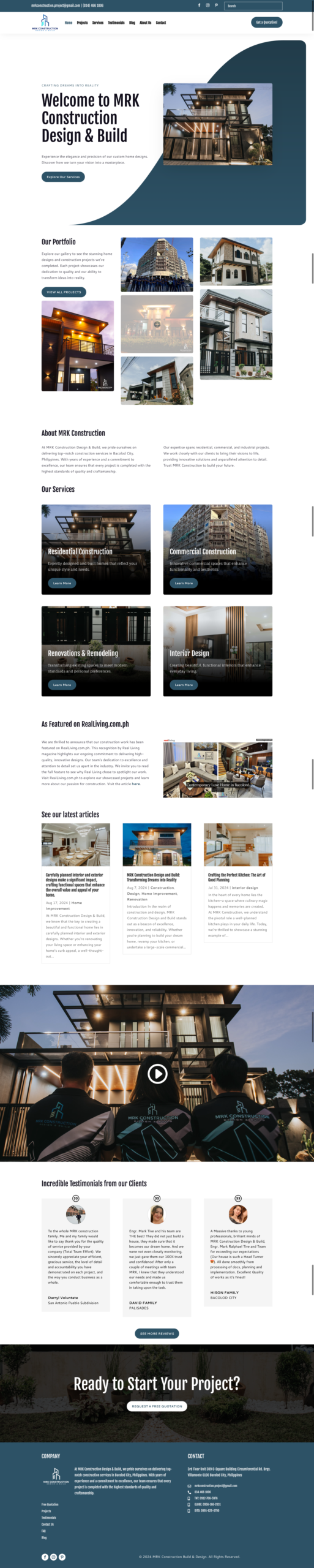
Good website navigation helps visitors understand where they are, find what they need, and take the next step without frustration.
Your navigation is more than a row of links. It is the map customers use to explore your services, judge your professionalism, and decide whether to contact you. If labels are unclear, menus are crowded, or important information is buried, visitors often leave before learning what your business offers.
1. Build the menu around customer goals
Start with the reasons people visit your website. Most business visitors want to understand your services, see proof of your work, learn about the company, and find a clear way to contact you. Give those tasks prominent places in the main menu.
2. Use familiar, specific labels
Labels such as Services, Our Work, About, Blog, and Contact are immediately understandable. Internal company language or clever wording can make visitors stop and guess. A useful menu prioritizes clarity over novelty.
3. Keep the main navigation focused
Too many top-level choices create decision fatigue. Group related pages under a sensible parent and reserve the primary menu for the pages that support the customer journey. Utility links, policies, and secondary resources can live in the footer.
4. Make the next action obvious
A clear call to action—such as Request a Quote, Book a Consultation, or Get a Free Demo—should remain easy to find. Use one consistent primary action instead of making several buttons compete for attention.
5. Design for phones first
Mobile menus need large tap targets, short labels, predictable dropdowns, and enough spacing to prevent accidental taps. Test the menu on real phones, not only by resizing a desktop browser. Important contact actions should not disappear behind several layers.
6. Connect related pages with internal links
Navigation does not end with the header. Service pages should link to relevant case studies, articles should point to related services, and project pages should guide visitors toward the next useful resource. These connections help both customers and search engines understand the structure of your website.
7. Use breadcrumbs on deeper websites
Breadcrumbs are useful when a website has product categories, resources, or several levels of service pages. They show the visitor's location and provide a quick route back to a broader section without replacing the main menu.
8. Test common tasks
Ask someone unfamiliar with the site to find a service, view a project, and make an inquiry. Watch where they hesitate. Analytics, search terms, form completion, and user feedback can reveal navigation problems that are difficult to notice when you already know the site.
A simple navigation checklist
- Every menu label is understandable without explanation.
- The most important pages are reachable within a few taps.
- The menu works with a keyboard and on small screens.
- The current page and dropdown state are visually clear.
- Calls to action lead to a working, relevant destination.
If visitors are getting lost or important services are difficult to find, request a free website demo and see how a clearer structure could work for your business.