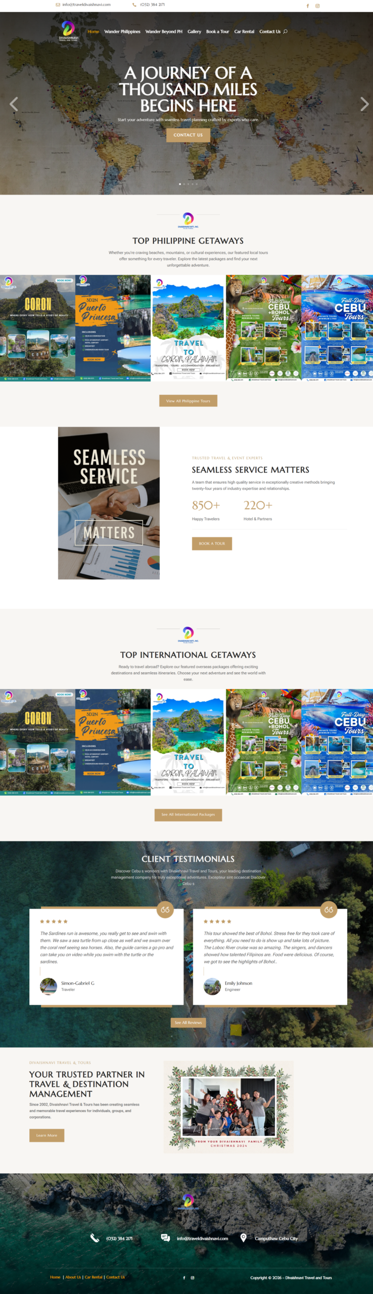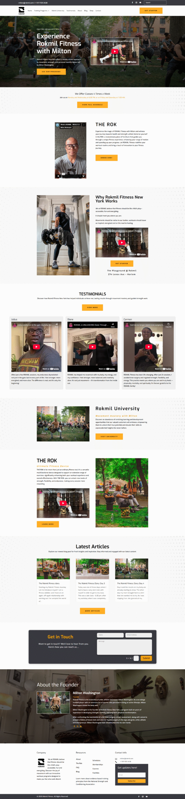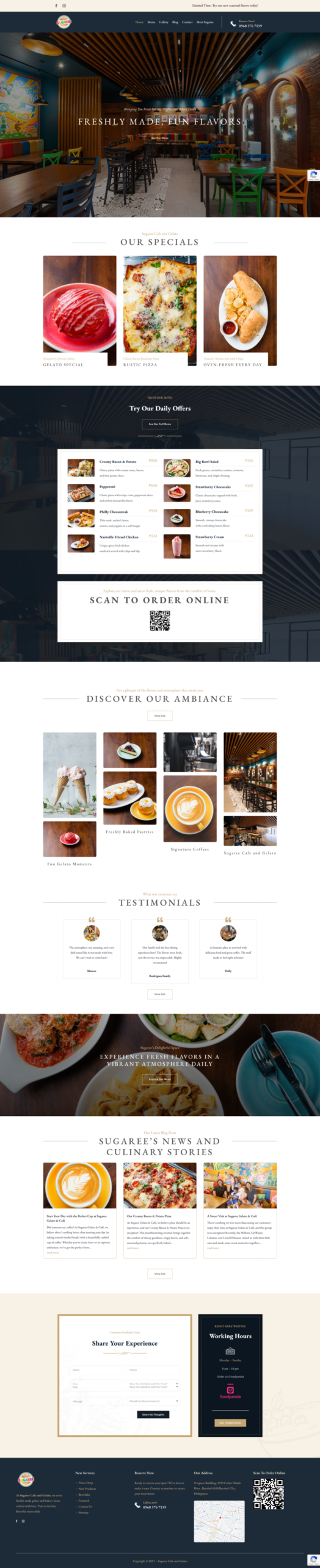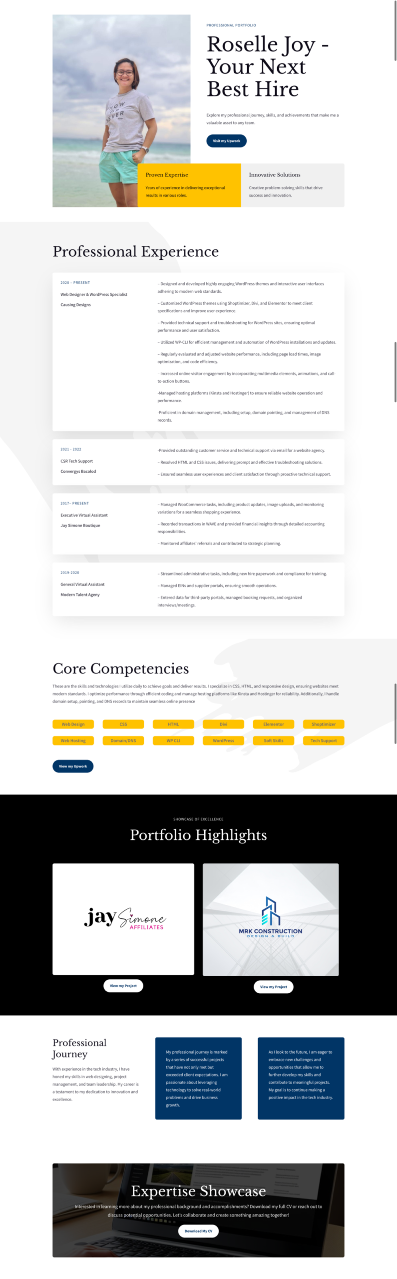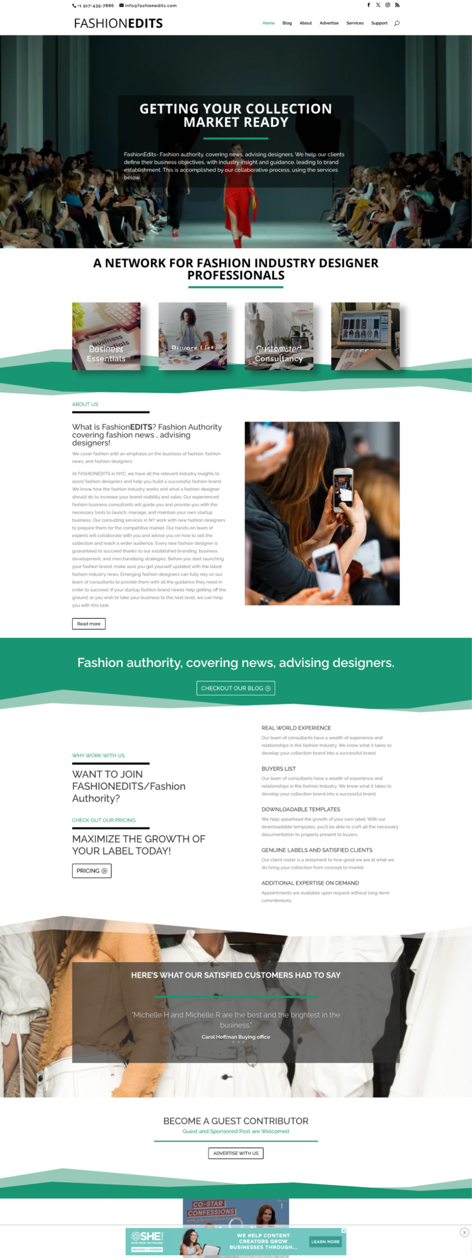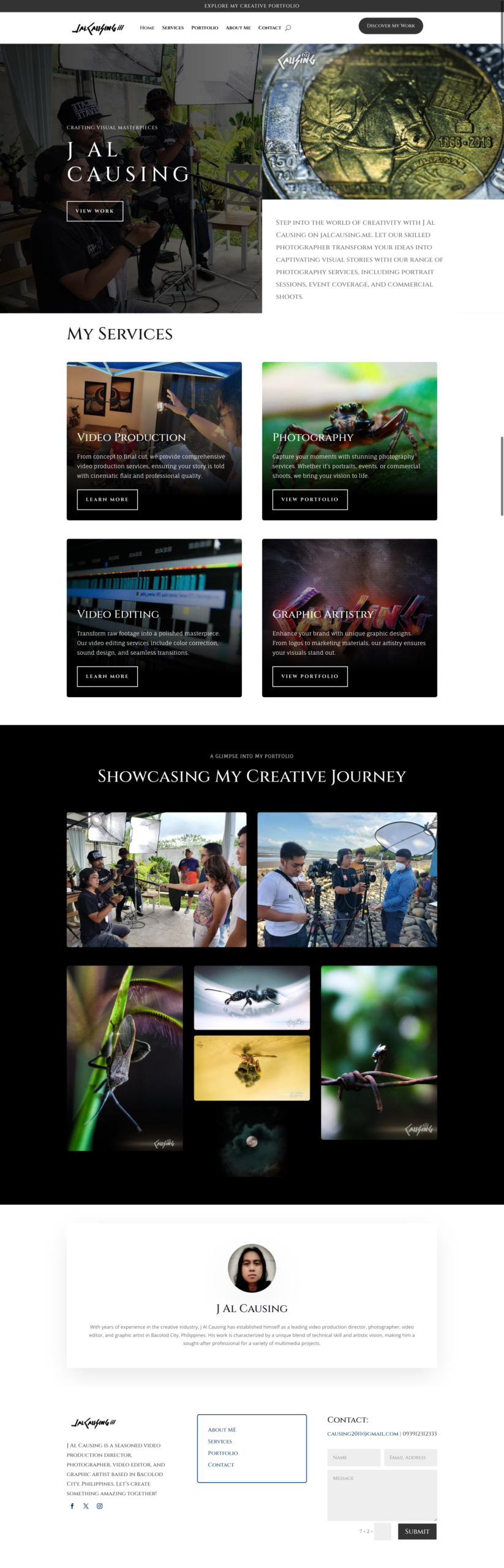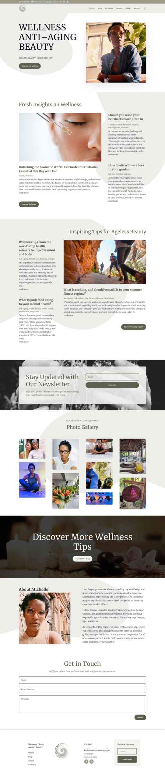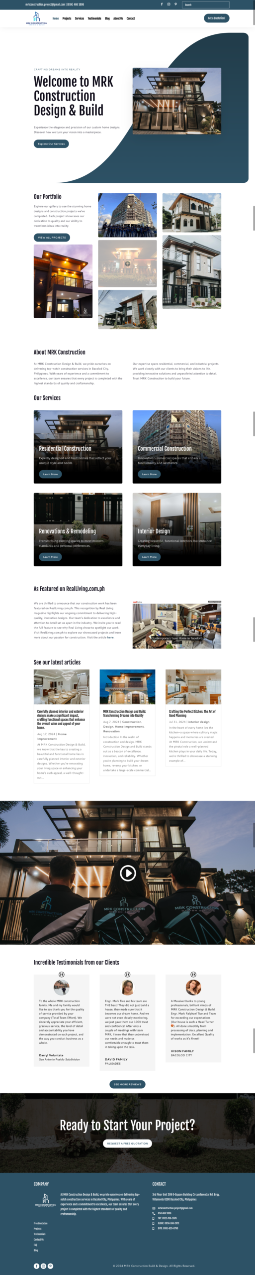
The best web design trends solve real customer problems. A trend is worth using when it makes the site clearer, faster, more accessible, or easier to trust.
Clearer, more direct opening sections
Strong websites quickly explain what the business offers, who it serves, and what visitors can do next. Large decorative introductions are giving way to concise messages supported by relevant proof.
Editorial typography with disciplined readability
Distinctive type can give a brand personality, but body copy still needs comfortable sizing, spacing, and contrast. Use expressive fonts selectively and keep essential information easy to read.
Purposeful motion
Small transitions can show that an action succeeded or help explain a change in state. Avoid animation that delays content, distracts from the message, or ignores a visitor’s reduced-motion preference.
Real photography and specific proof
Customers respond to credible evidence: actual projects, teams, locations, products, and processes. Original visuals and specific captions often communicate more than generic stock imagery.
Accessible interaction by default
Keyboard-friendly controls, visible focus states, useful alternative text, clear labels, and strong color contrast should be part of the design system from the beginning.
Faster, lighter pages
Efficient images, restrained scripts, and simpler effects support both usability and maintainability. Performance is a design decision, not only a task for developers at the end.
Modular content sections
Reusable service, proof, FAQ, and call-to-action sections help a growing business keep pages consistent while still tailoring each page to a specific customer question.
Useful personalization without clutter
Location, language, or customer-type choices can improve relevance when they are transparent and easy to change. Personalization should not make basic information harder to access.
When to ignore a trend
Skip any technique that conflicts with the brand, slows the page, hides information, or makes the interface harder to use. A familiar, clear pattern is often better than a novel interaction that visitors must learn.
For an evergreen foundation, combine these ideas with our website UX checklist and conversion-focused design guide.