")
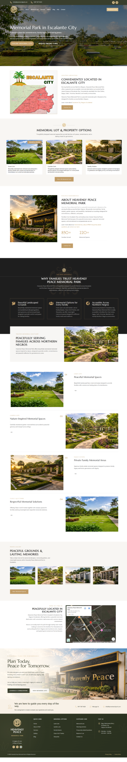
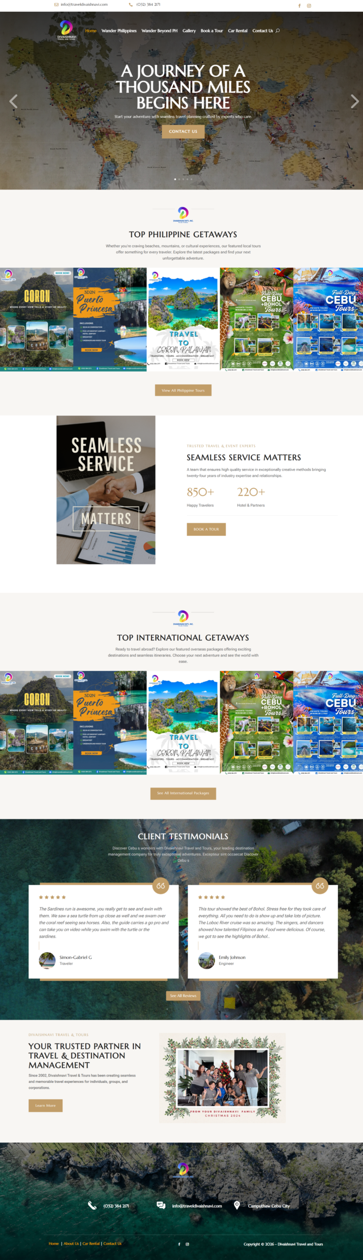
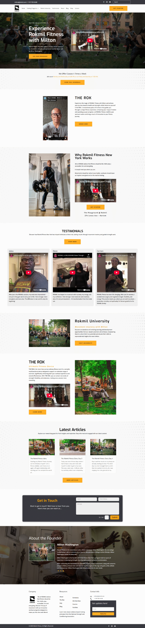
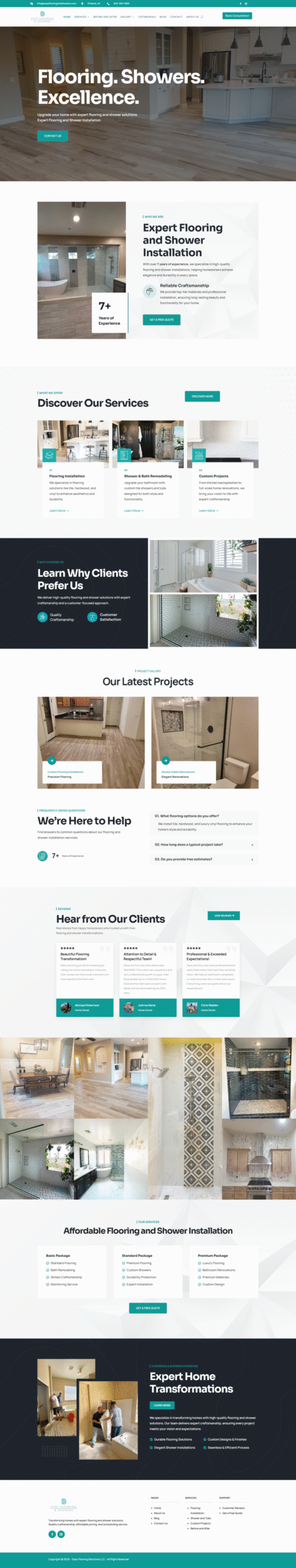
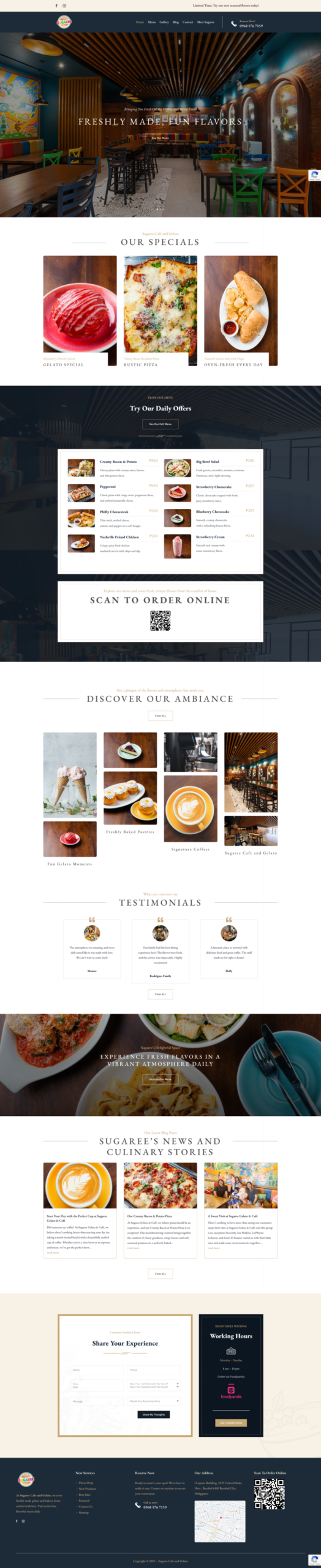
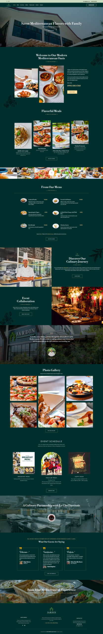
Alright, so you’re wondering what takes a website color scheme from “meh” to “OMG I love this!” right? I get it. We’ve all seen websites that are just… painful to look at. And trust me, a bad color palette can kill even the best content. But on the flip side, a killer color scheme? That can make your website feel professional, inviting, and totally on-brand. So, let’s dive into what separates the good from the great when it comes to web design color palettes.
It’s More Than Just Picking Pretty Colors
First things first, it’s not enough to just pick your favorite colors and throw them together. As much as I love hot pink and lime green (don’t judge!), those might not be the best choice for, say, a law firm’s website. A great color scheme is strategic. It supports your brand, enhances user experience, and even influences how people feel about your business.
Understanding Color Psychology (The Fun Part!)
Okay, I know, “psychology” sounds super academic, but hear me out. Colors evoke emotions. Blue often feels trustworthy and calm, red can be exciting and energetic, green is associated with nature and growth… you get the idea. Think about what feelings you want your website to convey.
For example, if you’re running a yoga studio, you might lean towards greens, blues, and earthy tones to create a sense of peace and tranquility. But if you’re launching a new energy drink? BAM! You might go for bright, vibrant colors like yellows and oranges to grab attention and scream “energy!”
Contrast is Your Friend (Really!)
Imagine reading white text on a slightly lighter background. Ugh, right? You want good contrast so that your text is easily readable, and your calls to action really pop.
Think about things like:
* Text color vs. background color
* Button color vs. surrounding area
* Using different shades of the same color to create depth
Tools like Adobe Color or Coolors can help you find color combinations that work really well together and ensure you have enough contrast.
Keep Your Audience in Mind
Who are you trying to reach with your website? A color scheme that appeals to Gen Z might not resonate with Baby Boomers, and vice versa. Do a little research on your target audience’s preferences. Are they drawn to minimalist designs with neutral colors, or do they prefer bold and colorful websites? Tailoring your color palette to your audience is a surefire way to keep them engaged.
Accessibility Matters (It’s Not Optional!)
This is huge. You want *everyone* to be able to use your website, regardless of their visual abilities. That means ensuring your color scheme is accessible to people with color blindness or other visual impairments.
There are online tools that can help you check your color contrast ratio to make sure it meets accessibility standards. It’s a little extra work, but it makes a world of difference.
So, there you have it! Creating a great website color scheme isn’t just about picking pretty colors; it’s about understanding color psychology, using contrast effectively, knowing your audience, and prioritizing accessibility. Nail those things, and you’ll have a website that not only looks amazing but also converts visitors into loyal customers. Now go forth and create something beautiful (and effective)!