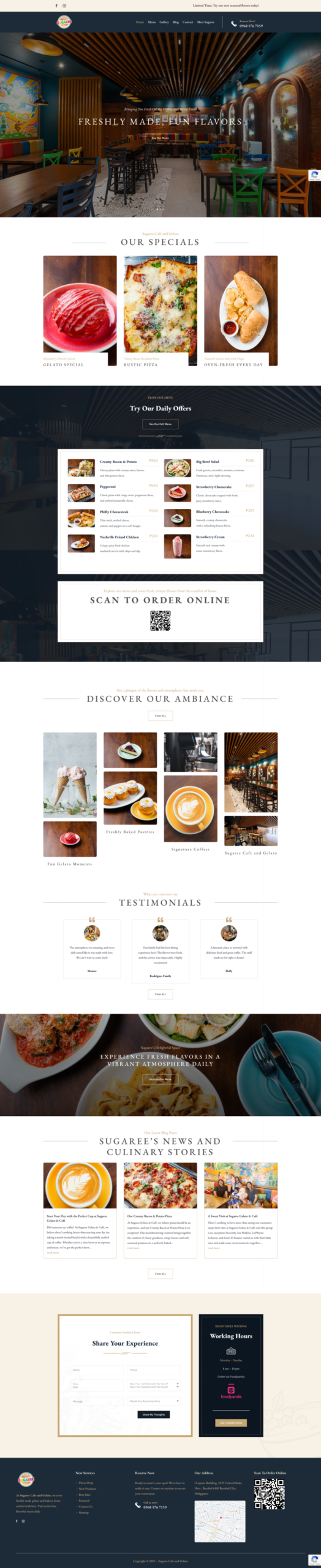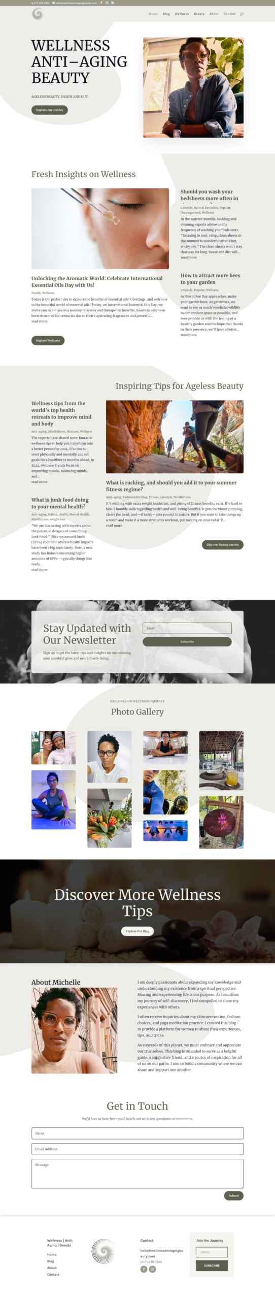
A good website color scheme supports the brand and makes the interface easier to understand. It should never force visitors to work harder to read or act.
Begin with the brand, not a trend
Identify the qualities the business needs to communicate, then review existing logos, signage, packaging, and marketing materials. The website should feel connected to the same organization.
Build a small functional palette
Most sites need a primary brand color, a limited accent color, and dependable neutral colors for backgrounds, text, borders, and muted elements. Assign each color a role so it is used consistently.
Protect text contrast
Body text, navigation, labels, and buttons must remain readable against their backgrounds. Test real color combinations rather than assuming dark and light versions will always work.
Use color to create hierarchy
Reserve the strongest accent for important actions and selected states. If every heading, icon, button, and decorative shape uses the loudest color, nothing stands out.
Do not rely on color alone
Error messages, required fields, links, and status indicators should also use text, icons, underlines, or another visible cue. This helps visitors who cannot distinguish every color difference.
Check photographs and backgrounds
Text placed over photography can become unreadable as the image changes across screen sizes. Use a stable overlay, a separate text area, or a crop selected specifically for the layout.
Test on multiple screens
Colors can appear different across phones, monitors, brightness settings, and dark environments. Review the complete page, including hover, focus, disabled, and error states.
Keep the system documented
Record the approved color values and their intended uses. A simple system helps future pages, campaigns, and team members remain consistent.
Color is one part of the overall experience. Pair it with appropriate website photography and the checks in our website accessibility guide.